Table of Contents
Travel and tourism have changed a lot in recent years, and the internet has been one of the most important parts of this change. People plan and book their holidays very differently now that there are so many online travel and tour sites. These websites give travelers a wide range of choices, such as flights, hotels, car rentals, holiday packages, and much more. Travelers love these services because they make it easy to compare prices, read reviews, and make reservations all in one place.
But because there are so many options, it’s getting harder to keep people on these trip and tour websites. You should do more than just bring people to your website; you should also keep them interested in what you have to give. Keeping people on a travel and tour website is important to its growth because it directly affects how much money the site makes from bookings.
It should be fun to plan your dream trip, but have you ever left a travel website feeling frustrated and let down? Here are five reasons why visitors leave your travel websites for good, and how you can avoid them on your own site.
Reason 1: Slow website load times
Website load times can be a significant problem for website owners, as they can lead to visitors becoming frustrated and abandoning the website altogether. Visitors will likely become impatient when a website takes up to two seconds to load. Their frustration can lead them to look elsewhere for the information they need.

Slow website load times can also harm a website’s search engine rankings. Search engines like Google consider website load times when ranking websites in search results. Websites that load slowly may rank less highly than those that load slowly, reducing the number of visitors who find the website through organic search results.
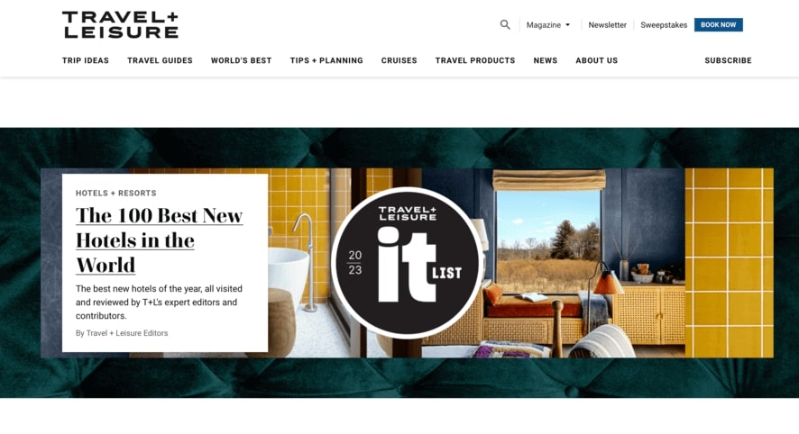
Travelandleisure.com is a popular online travel agency that offers a wide range of vacation packages, flights, and hotel bookings. However, despite its popularity, the website has struggled to retain customers due to its slow load times. According to recent data, the website’s bounce rate was 71% in March 2023, resulting in a significant loss in potential customers.
Reason 2: Lack of mobile responsiveness
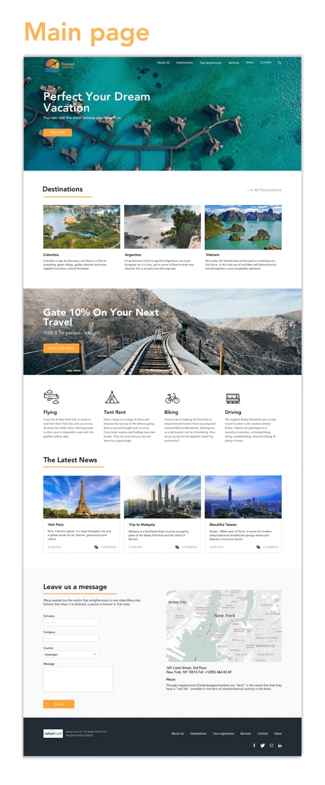
With the increasing use of smartphones and tablets, travelers are turning to their mobile devices for browsing and booking their travel plans. As a result, mobile responsiveness has become crucial for travel websites.
Mobile responsiveness refers to the ability of a website to automatically adjust its layout and content to fit the screen size of the device being used to access it. Without mobile responsiveness, travel websites risk losing potential customers who will quickly move on to a more user-friendly website
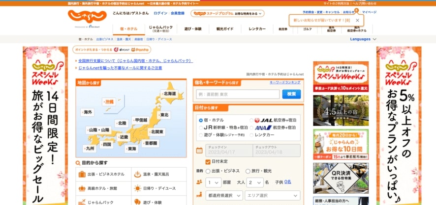
One such example of a travel and tour website that needs a mobile-responsive design is Jalan.net. Their website is primarily designed for desktop users.
While it may look great on a computer screen, it fails to deliver the same experience on mobile devices. Navigation becomes difficult, the text becomes too small to read, and images take too long to load. These factors lead to a poor user experience, causing mobile users to become frustrated and leave the site.
Reason 3: Confusing navigation and poor user experience
Imagine browsing a travel website looking for a specific destination or package. However, you can’t find what you’re looking for. The website’s navigation needs to be more precise, the search function must be fixed, and the user experience must be frustrating. As a visitor, this type of experience can be enough to make you abandon the website altogether and move on to a competitor.
In addition to being frustrating, confusing navigation and poor user experience can lead to a lack of trust in the travel website. Suppose visitors need help finding what they’re looking for or need help navigating the site. In that case, they may question the legitimacy and reliability of the website. This lack of trust can significantly impact the website’s conversion rates and, ultimately, its success.
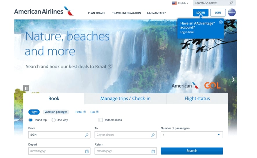
One example of such a website is a popular travel and tour site that boasts a wide range of destinations and options for travelers.
Unfortunately, the aa.com website’s navigation is overly complex, with multiple menu options and submenus, making it difficult for users to find what they are looking for. The site’s design could be more consistent, with different font sizes and styles throughout the pages, making it hard to read and follow.
Moreover, the site also needs clear calls to action, which can lead to frustration and confusion for visitors looking to book a trip or get more information.
Reason 4: Lack of relevant and engaging content

Relevant content is critical to attracting and retaining visitors to your travel website. Your content should be tailored to your audience’s interests and needs, providing valuable information they can’t find anywhere else. This could be travel guides, insider tips, or reviews of popular destinations. By providing your visitors with relevant content, you demonstrate your industry expertise, building trust and credibility with your audience.
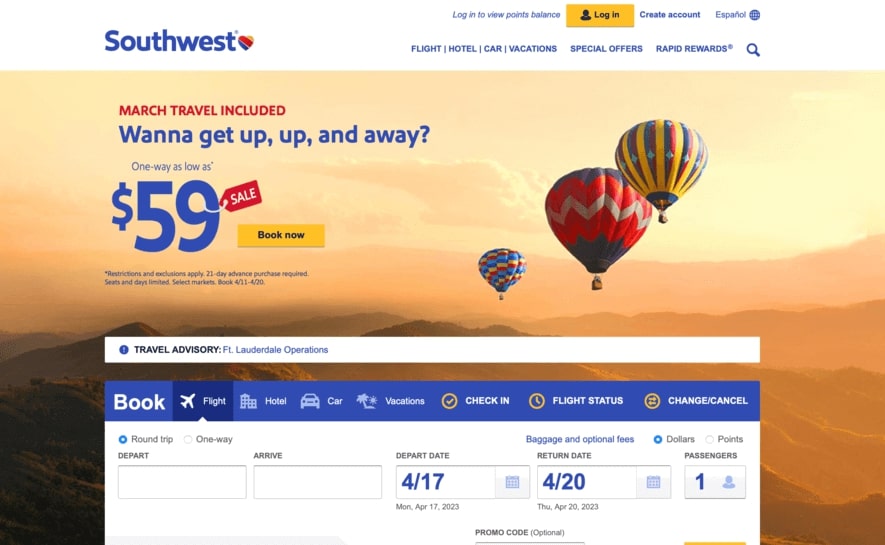
One such example is the southwest.com tour website that I recently came across. Upon visiting the site, I was disappointed that the visuals could have been better and more appealing. The images were low-resolution and could have showcased the destinations better. In addition, the descriptions of the various packages and tours were brief and needed more accurate detail and excitement.
Reason 5: Lack of trust and security
When booking travel and tour services online, trust and security are critical factors that visitors consider before making any bookings.
Visitors want to be assured that their personal and financial information is safe and secure when making online transactions. They want to know that their website is legitimate and trustworthy. This is why travel and tour service providers must invest in secure online booking systems that use encryption technology to protect visitors’ data.
In order to do it, make sure to have a dedicated page that explains your website’s security regulations and procedures. This page should clearly outline the measures you take to protect your clients’ data, such as encryption, firewalls, and regular security checks. By providing this information upfront, visitors will feel more assured that their trust is well-placed.
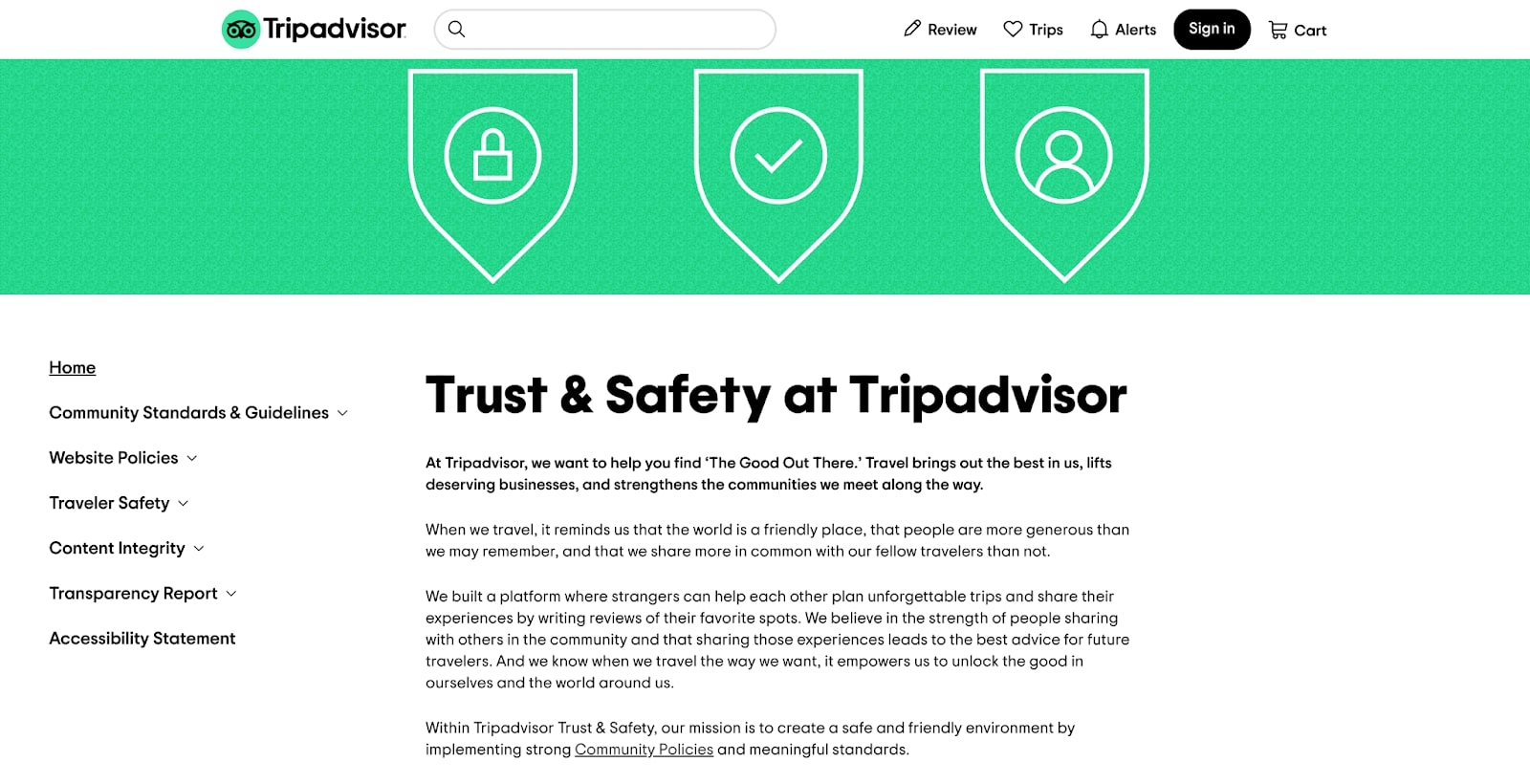
In addition to a dedicated security page, it’s important to implement specific regulations throughout your website. For example, require strong passwords and two-factor authentication to access personal accounts, limit the amount of personal data collected, and only work with reputable payment processors. These regulations, although seemingly small, can make a big difference in building trust with your clients.
For example, suppose a tour company does not have an SSL certificate. In that case, visitors may be hesitant to provide their personal and financial information on the site, as it is not encrypted and could be intercepted by third parties. Similarly, without customer reviews, potential customers may have no way of gauging the quality of the services offered by the website.
Finally, customers may be hesitant to purchase on the site without secure payment options, such as PayPal or credit card processing, as their financial information could be compromised.
Attention Travel Website Owners!
Are you tired of losing visitors and potential customers from your travel website? It’s time to take action and turn the tide in your favor. Introducing TravelerWP, the ultimate WordPress booking engine theme that will revolutionize your travel website and keep visitors coming back for more.
Don’t let visitors slip away forever. Choose TravelerWP and:
- Capture their attention with stunning design and captivating visuals.
- Provide a seamless booking experience with our powerful booking engine.
- Ensure lightning-fast loading speed to keep visitors engaged.
- Optimize your website for mobile devices, reaching a wider audience.
- Boost your search engine rankings and attract more organic traffic.
Don’t settle for mediocrity. Supercharge your travel website with TravelerWP and watch your conversions soar.
Ready to take the leap? Visit our website or contact us now to unlock the full potential of your travel website with TravelerWP. Don’t miss out on this game-changing opportunity. Act now and reap the rewards!
Conclusion
Visitors may leave travel and tour websites forever for five main reasons. Firstly, slow website load times can be frustrating and cause users to look elsewhere. Secondly, websites that lack mobile responsiveness may be challenging to navigate on smaller screens. Thirdly, confusing navigation and poor user experience can lead to frustration and abandonment. Fourthly, websites needing more relevant and engaging content may attract visitors’ attention. Lastly, lacking trust and security can make users hesitant to book or provide personal information.
