Table of Contents
Do you know that a tour agency’s online presence is one of the most important factors in how well their business does? The quality of the agency’s services is important, but the style and functionality of their website or mobile app are just as important. Discover the key distinctions difference between UI and UX design in tour agency industry. Enhance your website’s user experience and interface with our expert insights and practical tips. Stay ahead of the competition and optimize your online presence for maximum customer engagement.
User Experience (UX) design and User Interface (UI) design come into play at this point. UX design is mostly about making the user’s experience enjoyable and easy, while UI design is mostly about how the user interface looks.
When it comes to turning website visitors into paying customers for a tour service, you can’t say enough about how important a well-done UX and UI design is.
In this article, we’ll look at the main differences between user experience (UX) design and user interface (UI) design in the context of a tour agency’s website, showing how each part adds to the success of the business as a whole.
Understanding user experience (UX) design
UX design, which stands for “user experience design,” is the process of making digital tour services that are focused on the wants and preferences of the end customers. The goal of UX design is to make a product easy for the user to understand and enjoy. This is done by sticking to a set of key concepts, such as ease of use, accessibility, consistency, and putting the user first.
- Usability is one of the most important principles of UX design. A tour plan must be made in a way that is easy for customers to understand and use. This includes things like how the interface is laid out, where buttons and tools are put, and how clear and simple the language is.
- Accessibility is another key principle of UX design. A package must be made so that all customers can use it, no matter what their skills or disabilities are. This includes things like using alternative writing for images, being able to use a keyboard to move around the product, and using colors with high contrast for people who can’t see well.
- Consistency: UX design is also based on the idea that things should be consistent. The look and feel of a tour must be the same from start to finish, and the same goes for how it works. This includes things like using the same colors, fonts, and layout, as well as using the same words and message.
- User-centricity: Putting the user first is one of the most important UX design principles. When making a trip, the customer must be at the center of the process. This means taking into account the customers’ wants, preferences, and ways of doing things from the beginning of the design process until the final product is made. By putting the needs and wants of the customer first, a tour is more likely to be successful and well-liked by the target crowd.

Airbnb’s Experiences platform is a good example of a tour site with good UX design. The search and navigation tools on the site make it easy for users to sort experiences by location, category, price, and length. The booking process is easy and straightforward, with clear information about availability and prices. The platform also makes suggestions for each user based on their search past and what they like. The user can talk to the host before and after booking through the platform’s messaging system. After the experience, the user can also leave notes and ratings that other users can see. The positive reviews and high ratings of many experiences on the site show that these features make users happier and more engaged.
Understanding user interface (UI) design
UI design is an important part of modern digital marketing. It is the process of making the user interface for digital goods or services, like websites, apps, or software. The main goal of UI design is to make a user-friendly, easy-to-use, and visually pleasing interface that engages and satisfies the user. The UI design method is made up of several key parts, such as visual elements, layout, and interactivity.
- Visual elements: UI design is made up of things that can be seen. They include images, logos, icons, fonts, and colors. These elements are very important for getting the message of the tour brand across, setting up a visual hierarchy, and building a consistent design language. Visual aspects also help to build your brand’s identity and give users a unique experience that makes your packages stand out from those of your competitors.
- Layout: Another important part of UI design is layout. It means how buttons, menus, and information are placed on the screen. A good layout should be easy to understand and explore. It should also be responsive, which means it should change to fit different screen sizes and angles.
- Interactivity: The last part of UI design is interactivity. It means how customers use buttons, menus, and other interactive elements to connect with the interface. A good UI design for your website should give customers feedback, like animations, sounds, or visible cues, to let them know that their actions have been registered. The interface should also be responsive, which means that it should respond to user input quickly and easily.

Contiki is a great example of a tour site with a good user interface. Contiki is a business that specializes in tours for people between the ages of 18 and 35. The website is clean and modern, and it has beautiful pictures of their locations. The website is easy to find your way around and has clear call-to-action buttons that help people book their trips.
The responsive design of Contiki’s UI is one of the best things about it. The website is optimized for all devices, from desktop computers to mobile phones, so that users have a smooth experience no matter how they visit the site. Also, Contiki’s website has a consistent user interface (UI) design, with a clear and consistent look that helps people trust the site.
Key differences between UX and UI design
UI Design
Focuses on the visual and interactive elements of a product
Focuses on the aesthetic appeal and functionality of the product
Involves designing the visual elements of the product, such as typography, color schemes, and iconography
Aims to create a visually appealing product that is easy to interact with
Examples of UI design in action include designing icons that are easy to recognize, creating a color scheme that’s visually appealing, and choosing typography that’s easy to read.
UX Design
Focuses on creating a positive user experience through research and experimentation
Considers the user’s needs, goals, and pain points in order to create a seamless experience
Involves creating wireframes, prototypes, and conducting user testing to ensure easy navigation and clear information
Aims to create a product that is easy to use, intuitive, and solves the user’s problem
Examples of UX design in action include creating a user-friendly checkout process, designing a navigation menu that’s easy to use, and simplifying complex information

Let’s look at the Travel Advisor website as an example. The UX design would make sure that the website is easy to use and that the information about Travel Advisor’s services and products is clear and easy to understand. The UX designer would focus on the customer’s trip through the website, making sure that the customer can easily find what they need and book a flight or hotel. The UI designer, on the other hand, would focus on the look of the website, like the Travel Advisor color scheme, Travel Advisor font, and Travel Advisor layout, to make a visually appealing and easy-to-use interface that goes well with the UX design.
Importance of harmonizing UX and UI design for tour business
When UX and UI work together, the website is easy to use, easy to browse, and looks good. Visitors to tour websites can easily find the information they need, and the design of the website helps them book a trip or find the information they need. When UX design and UI design work well together, the user has a smooth, enjoyable, and memorable experience.
In the competitive travel business, a well-designed UX and UI can make users happier, get them more involved, and increase conversions. When people use a trip website or app, they want to be able to find what they’re looking for quickly and easily. A good UX and UI should be easy to understand and use, with clear access and features that are easy to understand and use.
For example, a travel website that lets users look for and book flights should have a clean and simple interface that makes it easy to find the right flight at the right price. The UX should be made with the user in mind, with features like filters and sorting choices that help users narrow down their options and find the best deal.
A well-thought-out UX and UI can also keep people interested and coming back for more. When people have a good time on a trip website or app, they’re more likely to use it again and tell their friends about it.
Lastly, a good UX and UI can help tour businesses get more sales and make more money. Businesses can boost their conversion rates and make more money from each user by making it easy for them to find and book travel choices.

In the travel business, which is very competitive, a well-designed UX and UI can make users happier, get them more involved, and lead to more sales. A good UX design makes it easy for the user to move around the website and find what they are looking for quickly. A well-designed user interface (UI) works on making the experience visually appealing and interesting so that the user stays interested and wants to look around more.
By mixing UX and UI design, designers can give users a smooth, enjoyable experience that keeps them interested and happy. This can lead to more sales, since happy users are more likely to book a tour or tell their friends about the website. A well-designed UX and UI also make it easier for the user to believe the website. Users are more likely to believe and feel confident in a website that is easy to use, looks good, and makes it easy for them to do what they want to do.

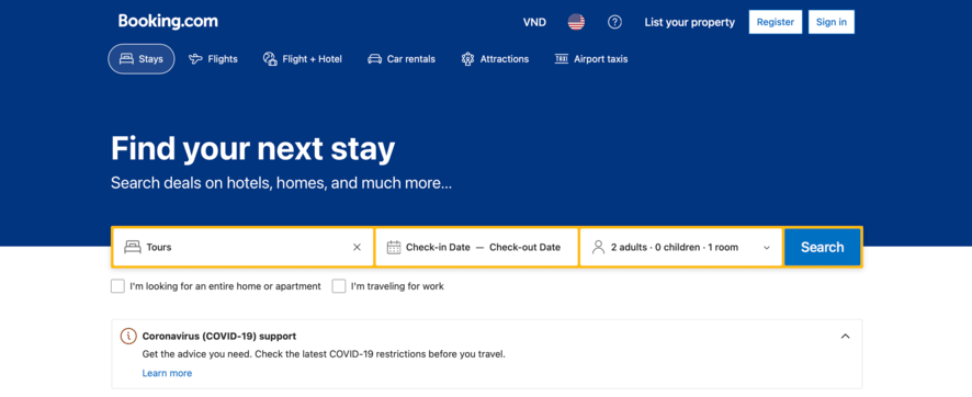
Several tour websites have combined UX and UI design in a way that works well, making the customer experience and business success better. Booking.com is a great example of a website that makes things easier for users by using accessibility settings. Skyscanner’s website is another great example of how UX and UI design can work together to make a site that is visually appealing and easy to use.
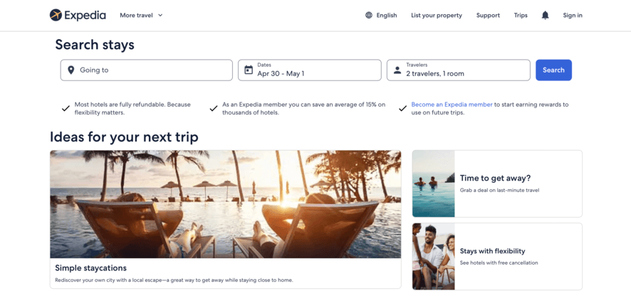
Successful travel agencies like Expedia and TripAdvisor are known for their great UX practices, like giving specific travel information, helpful logistical details, and tips to make the journey process easier. These websites use high-quality photos, useful tips, and helpful guides to make the user experience enjoyable. This increases conversions, builds trust, and gives them an edge in the travel business.
Attention Tour Agency Owners!
Looking to enhance the UI and UX design of your tour agency’s website? We have the perfect solution for you. Introducing TravelerWP, the beautiful WordPress premium theme designed to elevate the user experience and captivate your audience.
With TravelerWP, you can:
- Impress visitors with stunning and visually appealing design elements.
- Provide a seamless and intuitive user interface for effortless navigation.
- Showcase your tour packages and destinations in an engaging and immersive way.
- Create a memorable and delightful user experience that keeps visitors coming back.
- Gain a competitive edge with a professional and polished website design.
Don’t settle for ordinary. Transform your tour agency’s website into a masterpiece with TravelerWP.
Ready to elevate your online presence? Visit our website or contact us now to unlock the power of TravelerWP, the ultimate UI and UX design solution for tour agencies. Don’t miss out on this opportunity to leave a lasting impression on your audience. Act now and take your tour agency to new heights!
Conculsion
UX design is all about knowing what users want and how they act. On the other hand, UI design works on how the website looks and how it can be used. Harmonizing UX and UI design is important if you want your website users to have a smooth and enjoyable experience. In the competitive travel business, a well-designed UX and UI can make users happier, get them more involved, and increase conversions. Successful tour websites like Booking.com, Skyscanner, Expedia, and TripAdvisor have successfully combined UX and UI design to create a delightful user experience. This increases conversions, builds trust, and gives them a competitive edge in the travel business.
