How to Write a Booking Confirmation Email That Will Impress Clients?
Table of Contents
Mastering the Art to write a booking confirmation email: Create Lasting Impressions for Your Clients. In today’s fast-paced and competitive business world, making a positive and lasting impression on your clients is more important than ever. And one of the most crucial touchpoints in the customer journey is the booking confirmation email.
Not only does this email confirm essential details about the booking, but it’s also an opportunity to showcase your professionalism, attention to detail, and commitment to excellent customer service.
In this article, we’ll share some expert tips and strategies for crafting a booking confirmation email that will not only impress your clients but also help you build solid and long-lasting relationships with them.
Sounds great? Let’s get started!
Prepare the Content
To prepare relevant content for booking confirmation emails that can impress your customers, follow the tips below:
1. Include a clear and concise subject line
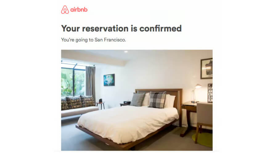
When you’re writing an email, it’s important to make sure your subject line is clear and to the point. This helps your customers understand your email before they even open it.
For instance, if you’re sending a booking confirmation, a friendly and straightforward subject line could be: “Your Reservation is Confirmed with A Hotel” or “Reservation Confirmation With A Hotel.”
2. Begin the email by thanking the customer for their booking
Beginning an email by thanking the customer for their booking is a simple yet powerful way to show your appreciation and build a positive relationship with them. It’s an opportunity to express gratitude for their business and let them know that you value them as a customer.
Dear John,
It’s confirmed, we’ll see you on [booking date].
We wanted to take a moment to personally thank you for choosing our hotel for your upcoming reservation. You’ll find details of your stay and payment details enclosed below.
3. Include booking details
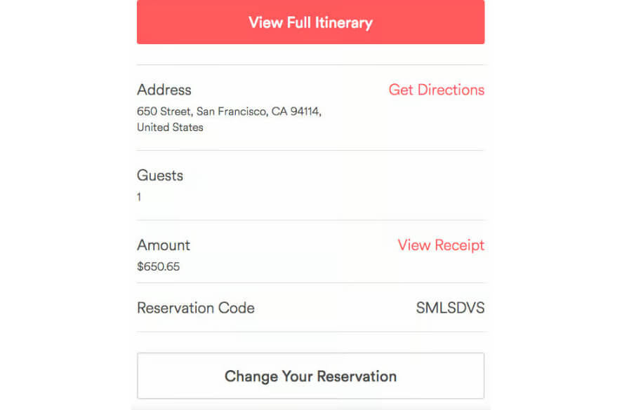
Now, you will need to include all the necessary details in one place to ensure a smooth and hassle-free experience for your guest.
For instance, you’ll want to make sure you provide the check-in and check-out dates, payment receipt,… as well as the room type and any special requests they might have made.
If there are any amenities or services they’ll have access to during their stay, like a spa or fitness center, be sure to mention them. By including all the important details upfront, you’ll help your guest feel more informed and at ease, ultimately leading to a more positive experience for everyone involved.
4. Include the cancellation policy and contact information for the travel agency
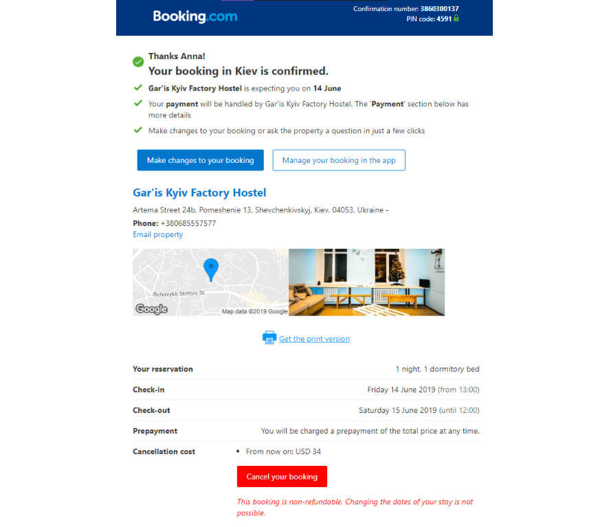
When communicating with customers about their bookings, it’s important to include clear information about the cancellation policy and how to get in touch with your company in case of any issues.
By doing so, you can ensure a positive experience for your customers and avoid negative reviews. Here are some tips on how to include this information:
- Explain the booking cancellation policy: Start by explaining your booking cancellation policy in a friendly and empathetic way. Let your customers know that you understand that things can happen unexpectedly and want to make the cancellation process as easy as possible for them.
Be clear about the deadline for canceling a booking for free and any fees or penalties that may apply for canceling after that deadline. - Provide contact information: In addition to explaining the cancellation policy, you should also provide clear and easily accessible contact information for your company. This could be a hotel hotline or a reservation manager’s phone number, for example. Remember to highlight that a phone call is the best way to contact your company, as an email may not be as effective.
Personalize Your Emails
When sending booking confirmation emails, your writing content is vital to increasing conversions and making a positive impression on customers. Consider these tips to create a personalized experience:
- Write in a friendly and personable tone. No matter what industry you’re in, avoid formal language and use words that sound like they’re coming from a friend.
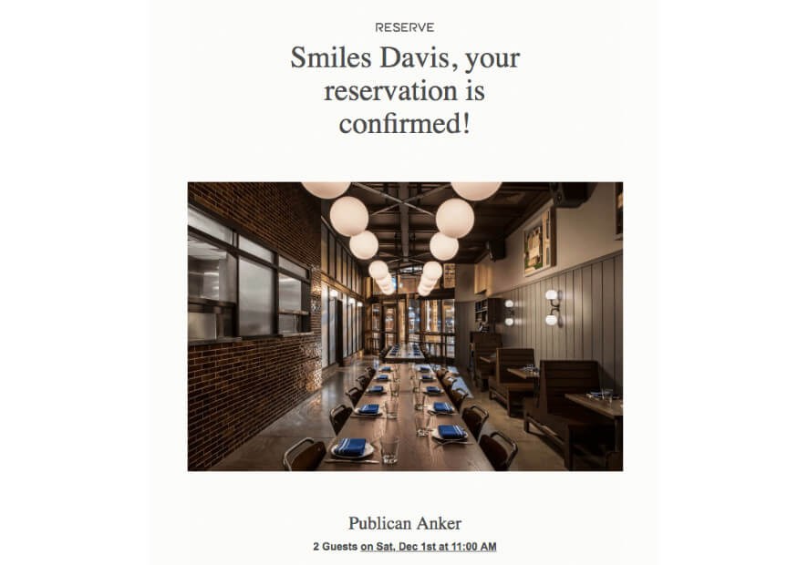
- Addressing the customer by their name: This is an essential aspect of creating a personalized experience. It would be best to use their name in the email subject line and throughout the email instead of a generic greeting to help make the customer feel valued and recognized. Ultimately, no one wants to make long last relationship with a travel company and doesn’t even remember their customer’s name.
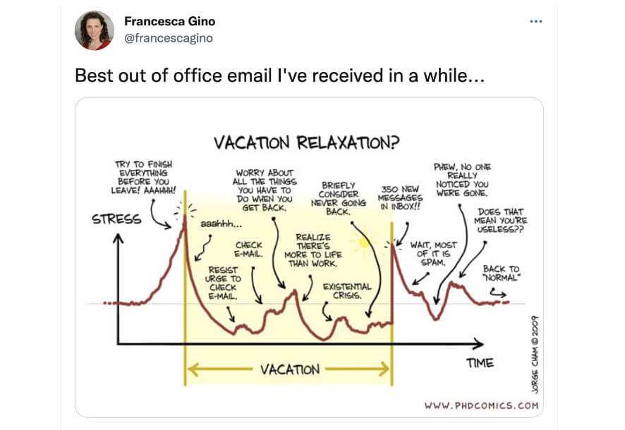
- Add a touch of humour to your email. It’s a great way to break the ice and make your customer feel more comfortable. By doing this, your emails will feel more like they’re from a friend rather than a business.
- Providing recommendations for other activities or services: In addition to confirming their booking, you can suggest other activities or services to your customers based on their interests.
For example, if they’ve booked a room for a romantic getaway, you could offer a couple’s massage or a candlelit dinner at the hotel’s restaurant. Or, if they’ve booked a family vacation, you could recommend nearby attractions or activities suitable for children.
Moreover, you can also use cross-selling techniques to offer incentives that may entice the guest to book additional services or activities. For instance, you could provide a free massage with the purchase of a spa package or a discount on a local tour.

- Include relevant content: Use the data you’ve gathered about your customer to offer them personalized information that they may not have known they needed. Consider what a caring friend would recommend and provide that information.
Branding and Design
Regarding booking confirmation emails, using professional and consistent branding and design is super important. But what does that mean exactly? Well, it means keeping everything about your brand consistent across all platforms and touchpoints – from how you talk about yourself to how you look.
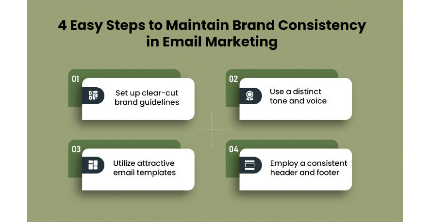
Now, we know it can be tempting to switch things up every now and then but trust us – maintaining a consistent brand image is key to building recognition and trust with your audience. That means sticking with certain fonts, colors, logos, tone of voice, and overall aesthetic in all your confirmation email materials.
Think about the big brands you see everywhere – they’re successful because they have a solid and recognizable brand identity. Plus, consistency reinforces your brand messaging and values and shows your audience that you’re professional and deliberate in everything you do.
Here are some easy tips you can follow to maintain brand and design consistency in booking confirmation emails for travel agencies:
P/s: Enhance Your Travel Website with Traveler Plus: A Premium WordPress Theme with Elementor Builder for Branding and Design. Traveler Plus is a feature-rich WordPress travel theme equipped with Elementor Builder, designed to elevate the branding and design of your travel website. With its seamless integration and intuitive drag-and-drop functionality, you have complete control over customizing your website’s appearance and layout.
Whether you’re a travel agency, blogger, or tour operator, Traveler Plus offers a range of stylish templates, stunning design elements, and advanced branding options to help you create a visually captivating and unique online presence. Elevate your travel website to new heights with Traveler Plus and unleash your creativity with ease.
Color palette
Did you know that using a consistent color palette for your brand can make a huge difference in how easily people remember and recognize your business? Just think of world-famous brands like McDonald’s with its bright red and yellow, Coca-Cola with its classic red, and Tiffany & Co with its beautiful robin’s egg blue. These colors are so closely linked to these brands that they help customers quickly identify them.
Why not take a few moments to brainstorm and pick out a color scheme that truly represents your brand and then stick with it in your email campaigns? It’s a simple but effective way to strengthen your brand identity and make it more memorable to your customers.
Logo
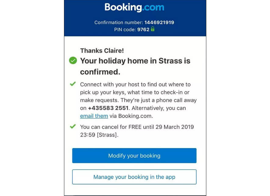
A well-designed logo can help solidify your brand identity and make your business more memorable. Plus, when your loyal customers see your logo, they will likely recommend your company to others.
So, when creating your email, make sure to include your awesome logo in the header! It’s a small investment that can pay off in the long run.
Images

Using consistent branding images in booking confirmation emails helps create a sense of familiarity and trust with your customers.
Establishing guidelines for the types of images or illustrations you want to use is a great idea. Start by considering what is most appropriate for your brand.
For example, including pictures of people who represent your target audience can help your customers identify with your brand more easily. Also, coordinate your imagery with your brand’s unique color palette. This will help ensure that your confirmation emails look professional and cohesive.
Typography
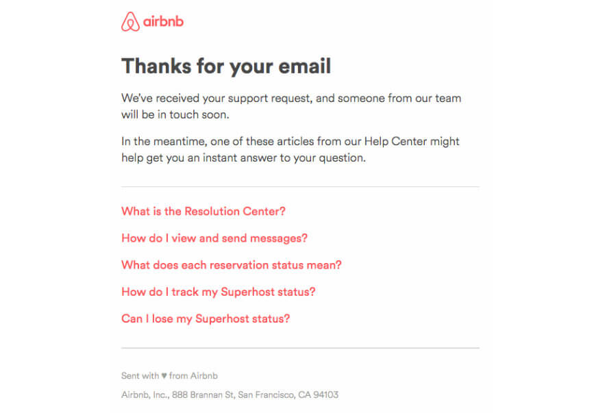
Making your confirmation email visually appealing and professional starts with consistent typography. This means choosing fonts that are easy to read and align with your brand’s style and tone. To create a unified look and feel, you can even establish specific font choices for different parts of your email, like headlines and call-to-action buttons.
When selecting fonts, keep readability in mind, especially for different screen sizes. And remember font size and color, as they also play a role in creating a cohesive visual identity. With consistent typography, your messaging will be easily recognizable to your subscribers, helping to build your brand’s reputation and attract new customers.
Call to Action
A well-placed CTA can guide your customers to take the next step and engage with your travel brand further.
- One way to incorporate a CTA is to provide a link to your website or social media accounts where customers can learn more about your business, browse related products or services, and stay updated on your latest offers and promotions.
- Another compelling CTA is to encourage customers to leave a review or provide feedback about their booking experience. Positive reviews and testimonials can help establish trust and credibility for your brand, while constructive feedback can help you improve your services and offerings.
- Finally, don’t forget to express your appreciation and gratitude to your customers. A simple “thank you for your business” or “we appreciate your patronage” can go a long way in creating a positive impression and fostering customer loyalty.
Example of a booking confirmation email
Here are two example booking confirmation emails to help you create your own:
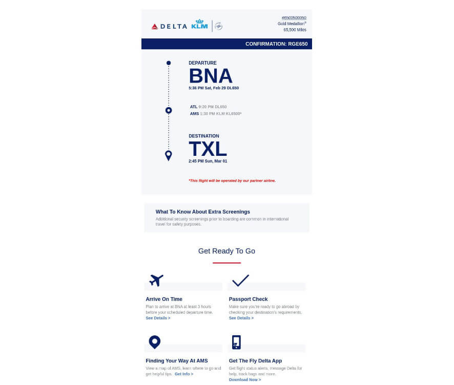
Sample 1: If you’re running a great attraction like an escape room, waterpark, or axe-throwing venue, your booking confirmation email must stand out. It’s important to ensure that your guests know all the important details, like the location, date, and time of their visit. Additionally, make sure to include clear instructions on how they can access their tickets so they can be all set for their upcoming adventure!
Subject: Your Tour Booking is Confirmed!
Email: Hey there, [Guest Name]!
We are thrilled to inform you that your booking for [tour name] has been confirmed! You’re about to embark on an adventure, and we can’t wait to be a part of it. We’ve included all of your booking details in this email, making things super easy for you. On the day of your tour, all you need to do is show us this email, and you’re all set to go!
Here are the details of your tour:
Date: [date]
Time: [start time-end time]
Recommended Arrival Time: [time]
Customer Details:
[Name]
[Email]
[Phone Number]
[Party Size]
Payment Details:
[Transaction Breakdown]
Meeting Location:
[Address]
Contact Information:
[Your company’s contact information]
Cancellation Policy:
[Your cancellation and refund policy]
We appreciate your business, and we can’t wait to show you around. If you have any questions, please don’t hesitate to reach out to us. We’re always happy to help!
>> Your CTA here
Best regards,
[Your name]
Sample 2: The following example we will provide will just be like confirmation emails for SMB tours or group tours. The main goal is to provide guests with all the important details. Consider what you would want to know if you attended the tour yourself.
And don’t be afraid to show some personality in your email. After all, this is a chance to showcase your brand and connect with your guests.
Here is what a confirmation email will look like if you own a ghost tour name:
Subject line: Get ready to be spooked! Your ghost tour registration is confirmed.
Email: Greetings, oh fearless [Guest Name]!
We’re excited to announce that you’re officially part of the ghostly gang for [Ghost Tour Name]! Get ready to have your socks scared off! We’ve included all the important details you need to know about your upcoming adventure.
Date: [date]
Time: [start time-end time]
Recommended arrival time: [time]
Customer details:
[Name]
[Email]
[Phone number]
[Party size]
Payment details:
[Transaction breakdown]
Meeting location:
[Address]
Contact info:
[Your company contact information]
Cancellation policy:
[Your cancellation and refund policy]
Prepare yourself for a night of terror — we mean, fun! Bring your bravery and your best ghost-hunting gear. See you soon!
[Spooky Signature]
Conclusion
Congratulations! You’re now equipped with the knowledge to write a booking confirmation email that will leave a lasting impression on your clients. Remember to keep it clear, concise, and aligned with your brand personality.
Don’t forget to include all relevant information, such as the date, time, location, payment details, and cancellation policy. And if you can, add some personal touches to make your guests feel valued and appreciated.
If you have any questions or would like some guidance in crafting the perfect booking confirmation email, please don’t hesitate to contact us. We’re always here to help!
Thank you for reading, and happy booking!
