Table of Contents
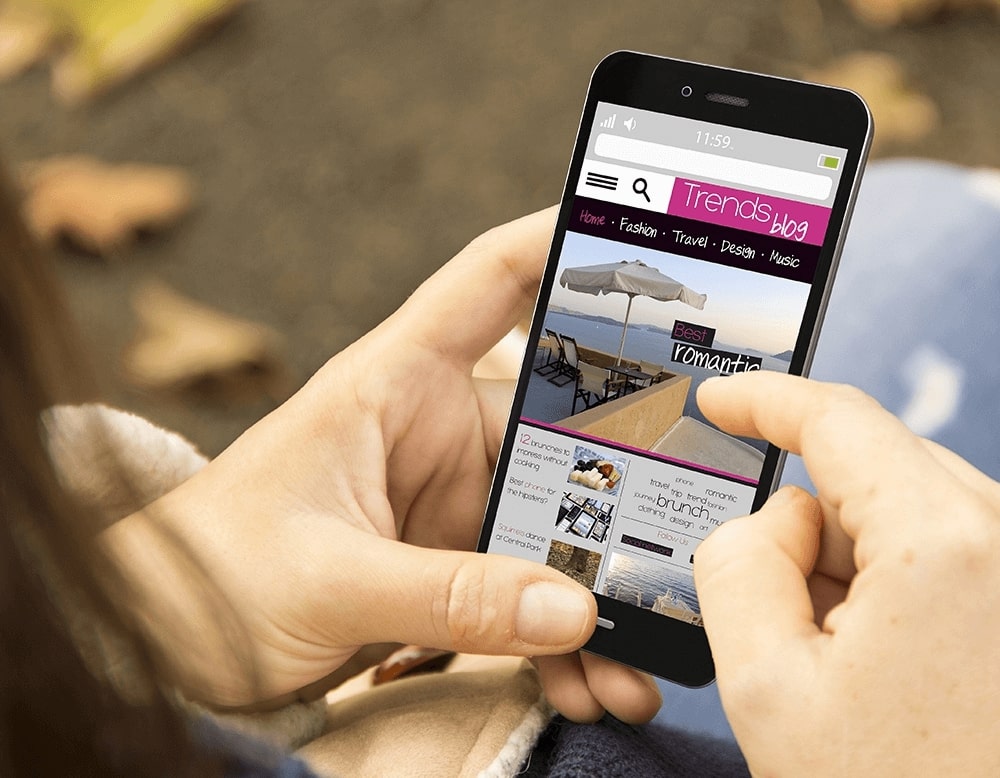
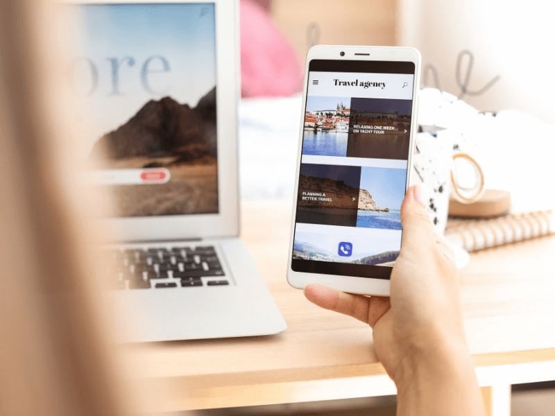
Because of the way they are designed, websites that are mobile-friendly bring in more sales and leads. When your website is mobile-friendly, people can use their phones, tablets, and computers to connect with your business without worrying about or being bothered by it. Investing early in this better accessibility is important for building long-term trust and keeping clients.
As more and more people visit your business website, it is important to make sure that all of your visitors have a good time, no matter what kind of gadget they use. If your site is hard to use on a mobile device or takes too long to load, they might go to a competitor’s site instead. Having a website that works well on mobile phones has some benefits, such as:
- More visible search results
- Increased customer satisfaction
- Growth in lead creation
- Increased company recognition
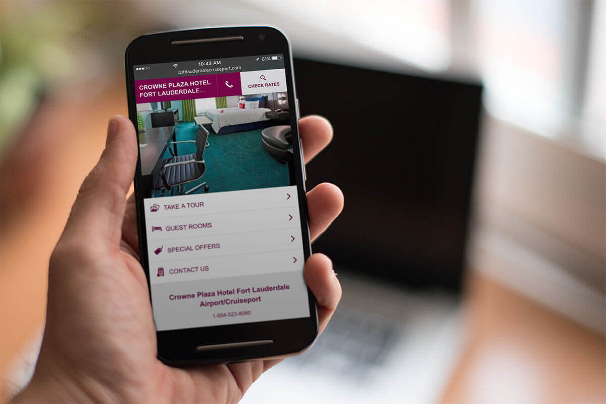
Benefits of mobile-friendly travel website
Optimizing your travel website for mobile users means ensuring that it’s easy to use and navigate on smartphones and tablets. This involves factors like making sure the text is readable, placing buttons and images in accessible locations, and ensuring that links are clickable. By prioritizing mobile-friendliness, you can create a better user experience for visitors who are on-the-go and accessing your site from their mobile devices.
There are also more perks to making a travel website that works well on mobile devices:
Faster mobile development at a lower cost
Even though some businesses still have a separate version of their apps for mobile users, user-friendly website design is becoming the rule because it gives more freedom and costs less to make. It takes a lot less time to make a sales-friendly website than to make a separate mobile app and a regular PC website. Since time is money, an app that is easy to use will cost less than one that is not. Also, if you have to make more mobile apps, you will save money in the long run on costs like maintenance, management, and so on.
Lower maintenance needs
When you have a different mobile app, you have to do more maintenance and management work for it. When making user-friendly websites, on the other hand, standardized testing methods are used to make sure that the style looks good on every screen. When you have different pages for desktop and mobile, you also need two content strategies, two admin interfaces, and maybe even two design teams. The “one size fits all” method of user-friendly design makes things easier for writers, business owners, and customers. Less time spent on paperwork gives you more time to work on more important things, like marketing and making content.
Faster page load
Mobile users in particular don’t pay much attention to things for long. Studies show that mobile users tend to leave sites that take more than three seconds to load. If a website isn’t made for smartphones and tablets, it will take longer to browse, which can annoy customers so much that they won’t come back. According to data on how many people use their phones to book rooms and trip packages, the number of bookings made through a smart device went from 31% in 2019 to 37% in 2020. In 2021, 41% of bookings were made with a smartphone.

Lower bounce rate
The mobile-friendly and optimized website provides a much better user experience for the visitors. Therefore, they are more likely to stay for a longer period of time and explore different content on your website.
Higher conversion rate
Reducing your bounce rate is only half of the battle. Creating a consistent user experience across all devices is key to increasing conversion rates. When users decide whether or not to sign up for a service, they don’t want to be redirected to device-specific sales sites because the process often takes longer.

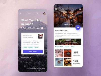
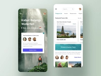
Understanding Mobile Optimization
responsive design for mobile optimization
When you have a responsive mobile app, it’s easier for people to share and link to your information about travel agency websites. All you need to do is share the URL. Content is looked at by Google and other search engines. Search engine results may include information from your website, which helps people find what you’re selling.
A responsive design can make it easier for people to use a website whether they are on a PC, a smartphone, or a tablet.
Also, as was already said, properly optimized responsive websites load much faster than normal mobile versions. Based on many page-loading studies, Google did a study that found that delays can make users very unhappy and cause them to leave the site and never come back. The results are the same for both well-known and little-known sites. This means that a slow website can cost you present and future customers.
If your travel site is optimized to look better and load faster, it will be more inviting to users and give them the best experience. Also, if people like your website, they are more likely to come back.
Best practices for mobile optimization
Ensure that all content is identical on desktop and mobile.
This best practice is meant to stop claims of cloaking and using the same content more than once. For extra security, make sure that all content is the same on all devices, including desktop and mobile. One of the best ways to make sure of this is to use responsive design.
For those who don’t know, responsive design involves making a style sheet that uses “media queries” to switch styles between a wide range of platforms and devices.

First sight, first impression
It’s important to remember that “above the fold” is still important in mobile design, even though information can be scrolled endlessly on mobile devices. Even though users are ready to scroll, putting some content at the top of the screen can encourage them to keep going. So, on mobile devices, it’s best to put important information or headlines above the fold
Even though mobile users behave differently, the psychological factors that make people want to explore and interact with material are still there, so it’s important to account for them. People are more likely to check out your website if the font or the material with an interesting title makes them want to know more. So, if you have a website for a tour agency, you should pay more attention to both the format and the title post.
Integrated display of website search bar
When a user is looking for something special, they often use the search bar to find it quickly.
Make sure your smartphone site has a site search. Make sure it’s the first thing that users see. Wayfair, for example, has a search bar that is easy to find. Users can look through thousands of goods to find exactly what they want.

Precise filter
If a site doesn’t have good filters, people will stop using it. The filter should be precise enough to let the person see only what they want to see.
When a site is set up for mobile devices, there is a filter button next to the search bar. And show how many options there are so that the user can narrow them down even more if they want to.
For example, when you look for a certain item at Macy’s, you can see how many results there are. And add more filters to make it easy for people to find what they’re looking for.
Designing for mobile
Assessing the mobile experience
Creating a travel website that works well on mobile devices will help companies grow by attracting more users and giving them a better experience. Most of the time, people use their phones to store things like pictures and important bills or papers that need to be paid attention to. And after they’ve used the travel package, it will be easy for them to upload pictures and write reviews on the website, saving them time and giving them more chances to take part in good programs and services, especially ones that could bring in new customers.
Tips for designing mobile-friendly travel website
Reduce the options
Navigation is another area that can easily become complicated if there are a lot of choices and places to go. In contrast to desktop websites, which usually have a full header navigation bar with multiple main menus and submenus, the hamburger icon has come to represent all of these navigation choices. Because of this, the image and that icon make up most of the headers on mobile websites.
Use the mobile’s suggested size and dimensions
On a portable gadget, space can look tighter than in any other design setting. The best way to escape problems down the road is to think about size limits at the start of your project.
The resolution of a mobile screen will rely on the device, but statcounter research shows that the most popular resolution right now is 360640, which has an aspect ratio of 9:16. Google Analytics can tell you which devices your users like to use, and you should make sure your website is flexible enough to adapt to changes.
Discard additional content
Information on mobile sites needs to be short and to the point. Content that isn’t important needs to be cut or shortened. Parts that can collapse or grow are useful in this case.
Content that can be expanded or hidden by clicking on an icon like a triangle or plus sign is called content that has been collapsed. Even though it might seem bad to hide your content, the benefits of easy browsing and interesting headlines far beat the chance that information will be missed. The micro-interaction of toggling is another way to get the user to connect with the website instead of just looking at it.
Limit text input and form fields
Text writing must be one of the hardest things to do on a mobile device. A word or two here and there isn’t a big deal, but who hasn’t sighed when a mobile site asked for an email address and made you use one hand to scroll through the alphabet, uppercase, punctuation, and symbol menus? So, you should cut down on form entries as much as possible.
Some of these interactions can be made easier with auto-fill features, like being able to figure out most of an address from a postal code or having choices for common email endings that are already filled in. Through connections with other profile-based software like Apple, Google, or Facebook, a user’s personal and login information can also be reduced to a few keystrokes.
P/S: Looking to design a mobile-friendly travel website? Consider using Travelerwp, a WordPress theme that’s optimized for mobile devices. To ensure a seamless user experience for your mobile visitors, it’s important to reduce the number of options on your site and prioritize key information. You can also use Travelerwp’s suggested size and dimensions to make sure your content is easily readable on small screens. Finally, consider discarding any unnecessary content to keep your site streamlined and user-friendly. With Travelerwp, you can create a mobile-friendly travel website that’s both beautiful and functional!
Technical Optimization
Improving site speed for mobile devices
Page speed is important for website owners because it directly affects the site’s ranking on Google, your ability to convert, interact, and use your services or goods.
So this is why any tour business would want to make their website easier to use. A study found that 47% of customers expect a website to load in less than two seconds. Another figure shows that 40% of people give up on a website after 3 seconds if it still hasn’t loaded. 52% of users stick with a website and visit it often because it loads quickly.
Compressing images
A large amount of unoptimized images is often the most common reason for a website to load slowly. High resolution images can consume a lot of bandwidth while loading. Therefore, you should extract your images suitable for mobile phones to help customers feel comfortable when accessing your travel website as quickly as possible.
Minimizing the use of pop-ups and interstitials
Placing pop-ups on your website is one of the best ways to improve website conversion rates and help share updates with users. However, the placement of pop-ups is an extremely important thing to ensure user experience. You need to have a strategy for placing pop-ups, from placement, content to images in pop-ups to attract users’ attention without disturbing them.
With that, all pop-ups are bad for a mobile-first approach. Pop-ups get bigger on small screens of mobile devices. This affects the user experience and leaves a bad impression on them.
Mobile-friendly website testing tools
Google’s Mobile-Friendly Test
The first tool you highly recommend is MobileFriendlyTest.info, this is an online tool that uses Google’s PageSpeed API, so it works quite correctly with a simpler interface that is easier to use than the original version of Google’s PageSpeed. When you analyze your website using MobileFriendlyTest.info, you get a lot of useful information such as screenshots of your website when accessed by mobile phone as well as providing you with metrics. Price of accessing the website by mobile devices.
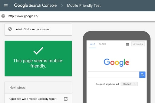
In addition to rating metrics, this site provides detailed information on what you should repair, what you should consider repairing, and what you’ve done right, helping you shape solutions. The next method to optimize mobile-friendly for your website.
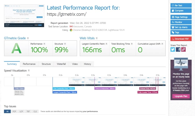
GTmetrix
It is a website performance analytics utility developed by GT.net, which is well-known in the online community for its Pingdom speed test tool. GTMetrix’s main goal is to analyze your website’s efficiency and give you a list of practical suggestions for making improvements.
The first tool you highly recommend is MobileFriendlyTest.info, this is an online tool that uses Google’s PageSpeed API, so it works quite correctly with a simpler interface that is easier to use than the original version of Google’s PageSpeed. When you analyze your website using MobileFriendlyTest.info, you get a lot of useful information such as screenshots of your website when accessed by mobile phone as well as providing you with metrics. Price of accessing the website by mobile devices.
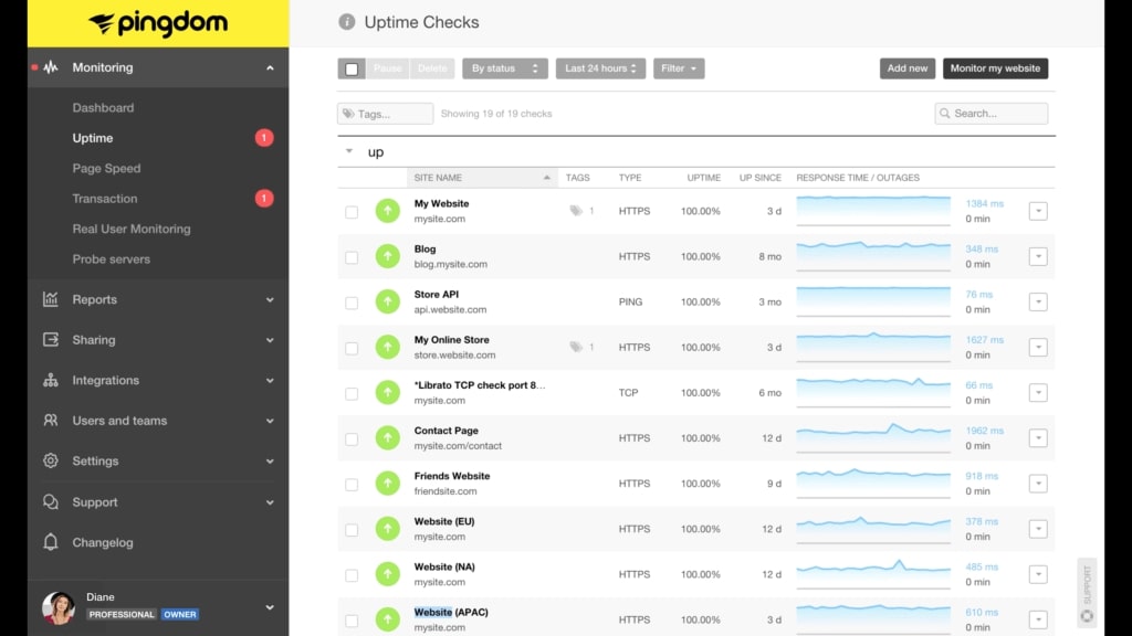
Pingdom
Pingdom gives you both a letter mark and a score between 1 and 100. You’ll find a brief summary of suggestions for performance improvement underneath that. You can learn how to solve your issues in plain English by clicking on them.
These explanations are a good spot to start, but they won’t make a beginner into an expert. You can also select the location of your exam there.
User Experience
Prioritizing user experience
Mobile navigation and user interface
Learn about what travel agencies can do to develop a fast, smooth, and personalized mobile experience to positively impact business results. Focus on mobile speed. Need to create simple web pages and short links that make website connection fast for users to provide a smooth experience for mobile users
Provide a personalized mobile experience for users. Customers want convenient and personalized services that give them space and time to think and plan their trip.
Mobile-optimized search function
Nowadays, more and more people use mobile phones to access websites. They will look up information to find the closest service and location to them, get directions via google map, connect to social networks from the phone… In short, optimizing mobile SEO on mobile devices is an urgent matter. Currently for businesses that are doing business online and owning a website to promote online communication.
Mobile SEO brings a lot of benefits to online marketing. According to the research, mobile devices account for 60.67% of page traffic. The developed mobile communication channel will help users access and shop easily. Businesses will reach out to potential customers and increase conversion rates.
User-friendly booking process
For a company or travel agency, a website to promote is like a second face, where customers will come to learn first about their products and services. Therefore, it is required to have a professional website that is both friendly and easy to use, and highlights their products and services, in order to attract the attention of customers at first sight.
As a website designer, you should have clear categories at the top of your website so customers can follow and find the items they need to research, making their booking process fast and simple. best.
testing and monitoring user experience
User experience testing and tracking are very important because they help businesses learn how people use their products and services. By testing and keeping track of the user experience, businesses can find possible problems or areas for improvement. They can then make the changes that are needed to make sure the user experience is good.
90% of people who used a tool gave up on it because it was too slow. 32% of customers will stop buying from a company they love if they have one bad experience with them. In other words, user experience is the glue that keeps people coming back to your apps. It’s a big deal. important in a big way. So, your business should use monitoring tools to keep track of data and customer demand.
Examples of Mobile-Friendly Travel Websites
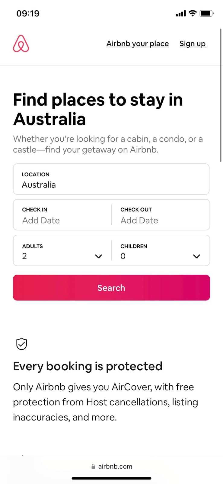
Airbnb
On the website Airbnb, users can advertise, look for, and rent out lodging. The creators of Airbnb are design graduates, and it is clear from looking at their website that they gave user interface and user experience a high priority.
Airbnb is inventive because it makes use of large folds to fit eye-catching images of travel destinations. One of the finest mobile website examples with a ton of options and complexity is Airbnb, which is remarkably easy to use and straightforward for a mobile website.
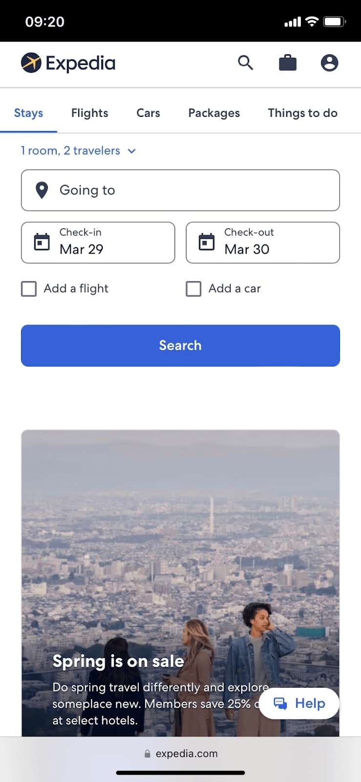
Expedia
Expedia is a well-known online travel agency with a responsive website that makes it simple for customers to look up and reserve travel choices on their mobile phones. Expedia is an especially good choice for people who want to pay for their flights, lodging, and rental cars all at once. With the simplified and friendly website, it allows users to connect and book rooms and their travel package for their journey.
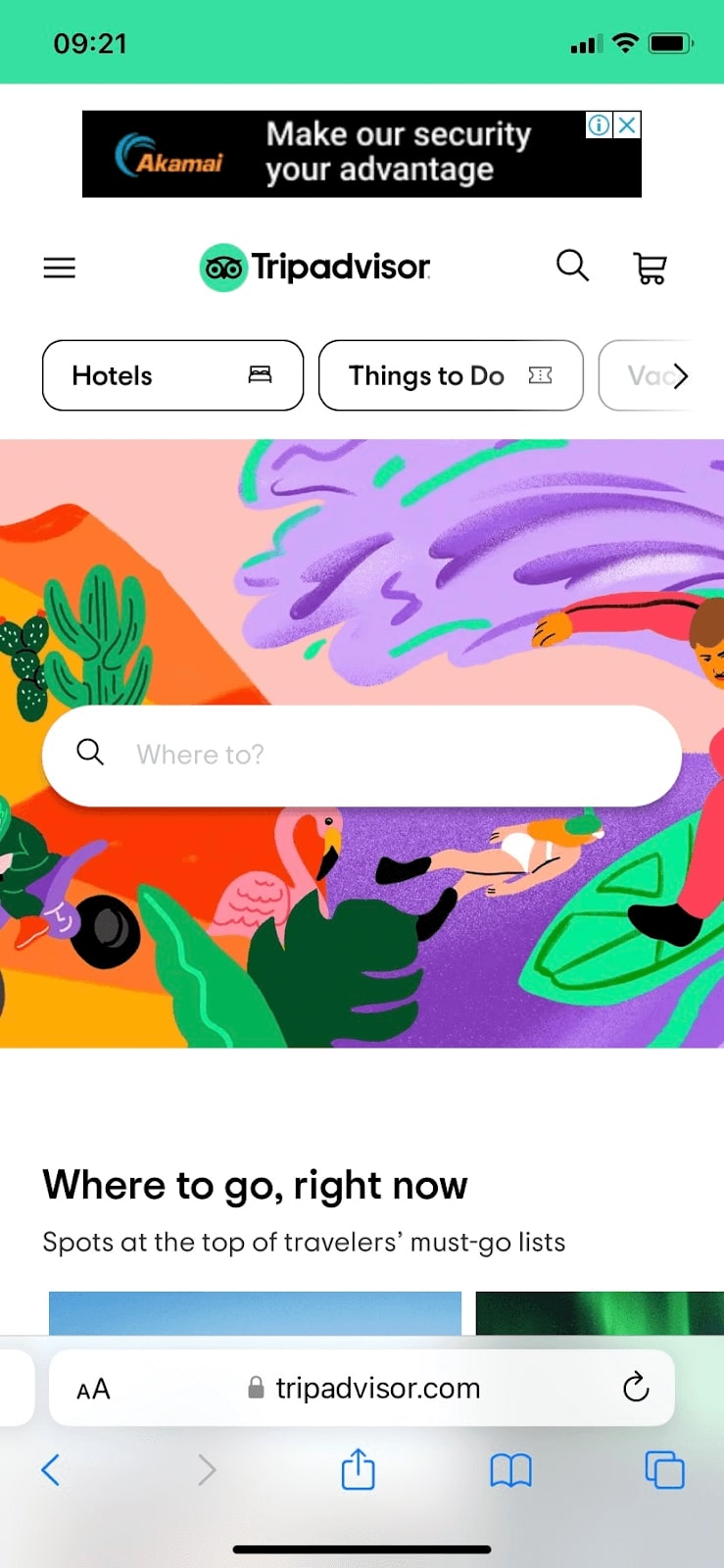
TripAdvisor
TripAdvisor is a well-known online travel service that has a website that is easy to use on mobile phones and tablets. This makes it easy for people to look at travel options and book them from their phones or tablets. The website has changes that happen in real time and work perfectly. With real-time information on hotel availability, prices, and other travel options, users can make well-informed decisions about how to plan their trips. Among other ways to pay, you can: On the mobile website, there are many ways to pay, like PayPal and credit cards, which makes it easy for users to finish their orders.
Conclusion
For your travel website to be seen by more people, generate more interest, and lead to more reservations, it must be mobile-friendly. You can build a mobile-friendly website that satisfies the demands and expectations of your mobile users by adhering to the recommendations and best practices discussed in this article.

