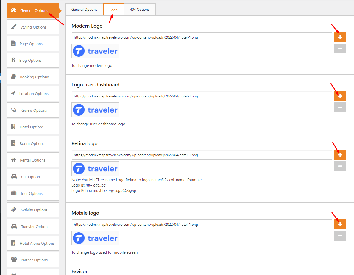
On the Theme Options> General Options> Logo

NOTE:
The recommended logo dimensions for a web page are 250 x 150 px for the vertical layout in PNG format. If your logo is too big or too small on the mobile screen. You can change it by adding a custom CSS
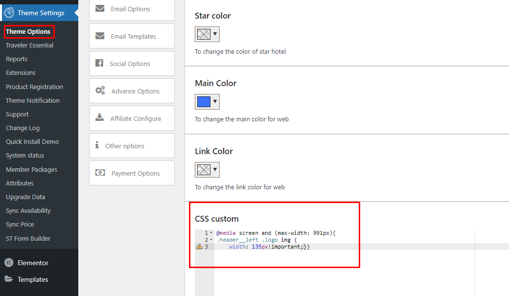
Go to Theme Options > Styling Options > CSS Custom and paste the code below. You can change the width of logo you want. For example, I change my logo to 135px
					@media screen and (max-width: 991px){
.header__left .logo img {width: 140px!important;}}

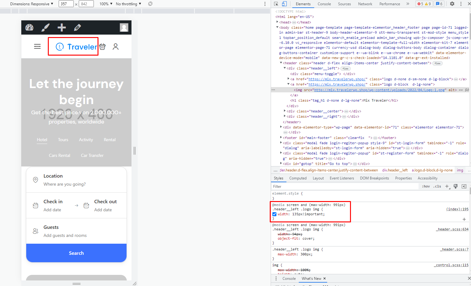
Now, you can see how your logo has changed on mobile devices
